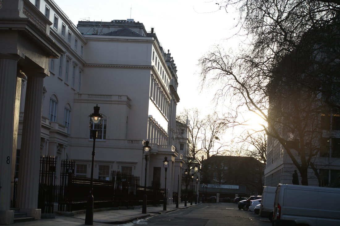
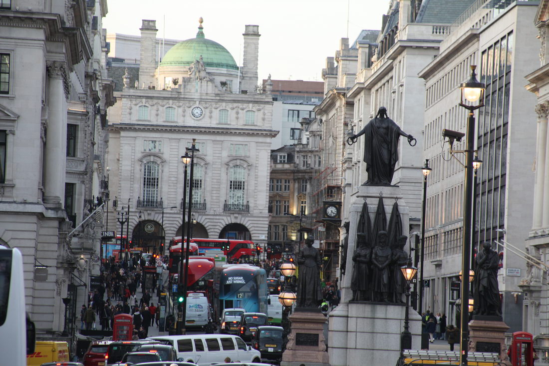
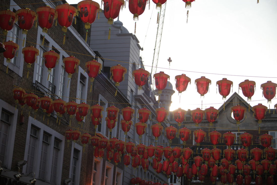
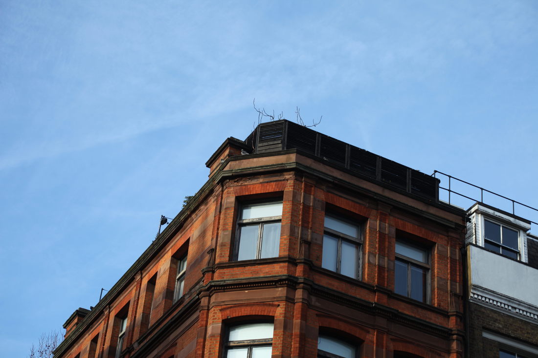
City fragments
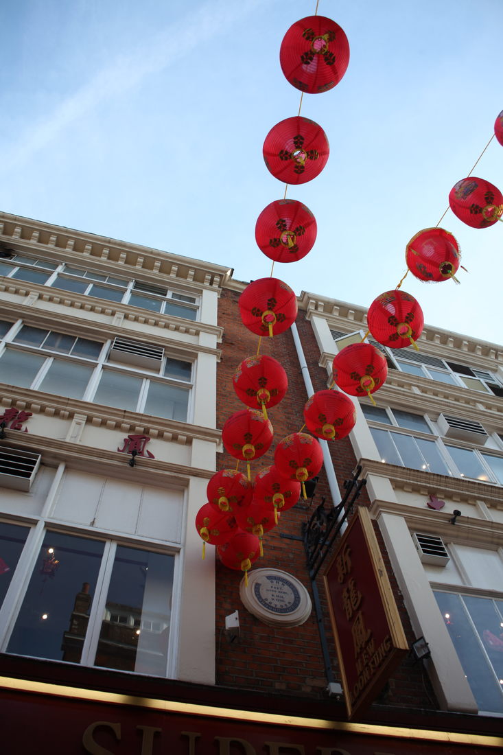
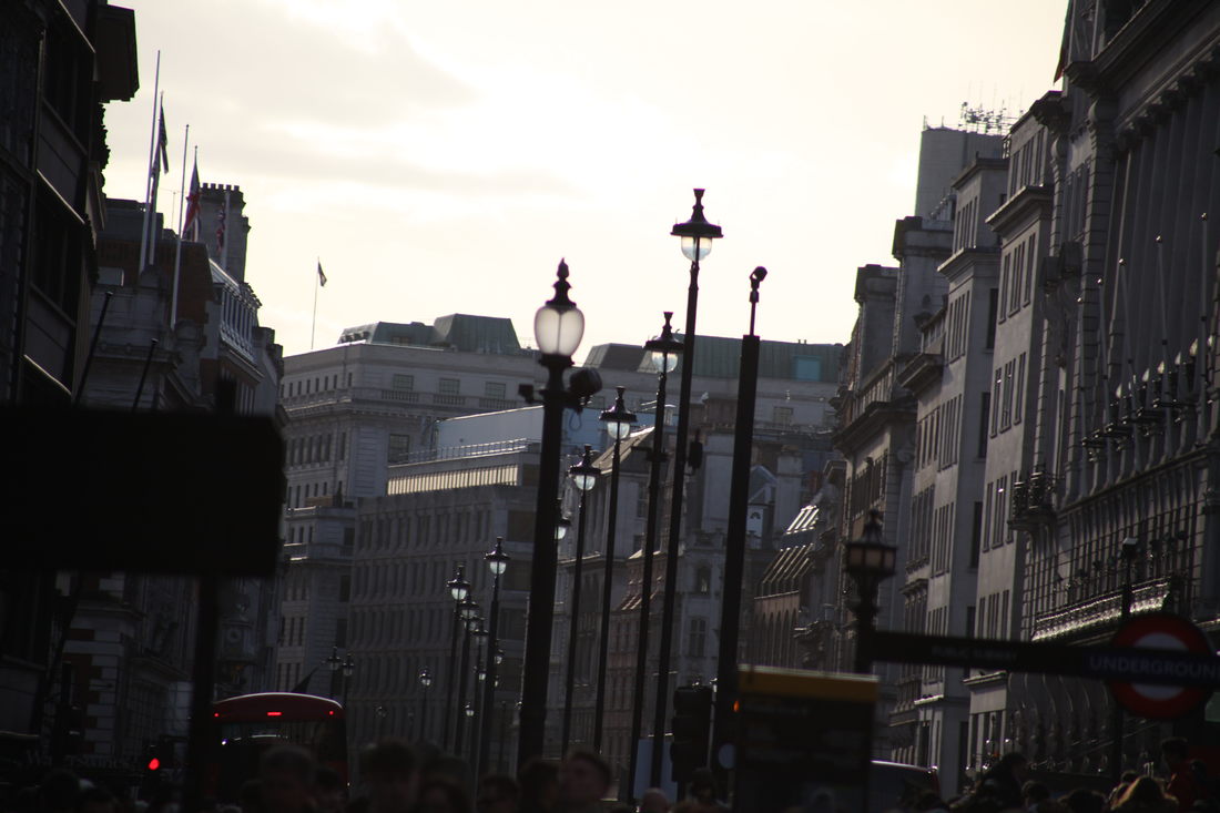
For this section I took pictures of fragments of buildings: either an image of just a small part of a building or a building cut up and obstructed by the foreground (e.g. trees, people, lanterns, signs...). This creates a distorted and blocked view of the urban environment, bringing attention to details and representing the chaotic and claustrophobic nature of the city. The blocked view restricts information from the viewer and forces them to sometimes look a bit harder in order to fully understand and comprehend the images. I used a high focal length (70-300mm) as when zoomed in the buildings layer over each other and get even more detail.


BEST 3

|

|

Some of my images effectively reflect the task as I put a lot of detail in frame, making the city and image seem claustrophobic and confusing to the viewer. Also I think the editing made the image more aesthetically pleasing as for the 'best images' I cropped it to work with the rule of thirds and to focus on more detail and I also used colour balance to make the image a bit more colourful and to warm the image accordingly. I also used strong shadows across buildings to fragment the face of the building, cutting through and further relating to the theme of fragments. The images had a nice contrast between light and dark which is appealing to look at but occasionally it's too dark and detail is lost to the viewer. I think the images also represent the theme as the amount of detail and the large volume of buildings layered over each other create a sense of fragments layered over each other as if in a collage. I think some of the images could be better if I went even further to show the theme by possibly using other obstructions. Also a few of the images were blurred so I should've had shutter speed on priority or taken the photos at a time when the lighting was brighter.
Sun ji
|
Sun Ji has a series called 'Memory City' which is a “part cubist collage and part hyperreal landscape” made up from many images of buildings and urban landscapes. This creates a hyperrealistic image of the urban environment giving the viewer a look into the disordered layout of cities. It shows the chaos and the sheer volume of activity in urban landscapes.
|
|
My process:
From images taken around London and around the school, I created a collage inspired by the artist above:

My attempt
I believe my image represents the artist and captures the same disorder and disorganisation. I think it could be better if the buildings flowed and fit better with each other and some of the masking wasn't very clean and sharp although it's mostly unnoticeable. This shows the themes of fragments as it's fragments of the city coming together in a collage to represent the entire city environment. I think to improve I need to mask the buildings better and consider the placement and colours so that the buildings fit better together as some of the buildings are under different lighting and don't flow as naturally as the original artist makes them. Furthermore, some of the buildings are at odd angles which don't work with the composition so I have to make sure my source photos would work well.
Patrick Cornillet
|
Patrick Cornillet pictures concrete architecture and structures with the background completely white. This fragments the buildings, giving focus to only a small section of the structure and making it easier to focus on the details. This reflects fallen and abandoned society as the buildings pictured are abandoned.
|
|
My process:
|
To create these images I used a layer mask to isolate only one part of the image (generally using the quick selection tool or the poly lasso tool) and below it I have a white fill layer.
|

|
Using images from around central London I created my own replication of Patrick Cornillet's art:

|

|
I think these images would be better if I used more interesting concrete structures rather than what I chose to use. I think the masking worked well though and I got a sharp image. This shows the concept of fragmentation as it strips away the majority of the image leaving a small structure behind, which may be unidentifiable on it's own. Next time I should try a more interesting structure and possibly a more complex building with nicer shapes so there's more to look at.
fragments of nature
|
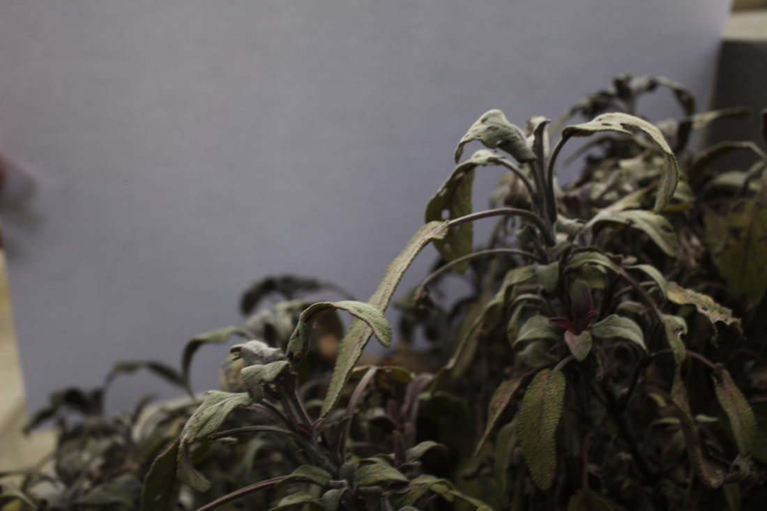
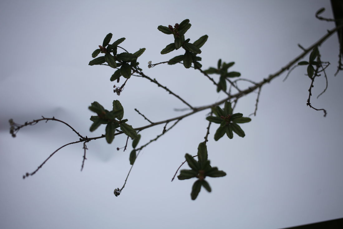
Myoung Ho Lee placed giant sheets of paper behind trees to make it stand out in the image and from the environment it would usually mix in with. This brings focus to a small part of the image the viewer may not usually consider. It fragments the image by blocking out and bringing focus to the normal and makes us consider the link between artificial and nature.
|
|
In this task we replaced the background with an A3 piece of paper to bring attention to the plant itself and separate from the rest of the image. This fragments the plant and the picture bringing attention to the detail.


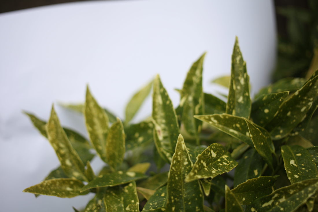


best 3

|

|

These images are good aesthetically but I don't think they effectively show the theme. One can argue the paper behind the plant fragments and separates it away from the environment but I don't think it's done as effectively as Myoung Ho Lee who's images are much more dramatic as you can see the separation the artist has created while in my images it's more natural. Other than that, I think the colours and composition of my images are nice, but in the end it doesn't fall well into the theme of fragments.
Fragments of a person
For this task I took pictures of my brother's room and possessions to try and capture his personality and persona without actually taking pictures of him as a person. This shows fragments of his life and belongings which gives the viewer a patchwork view into his life and memories.


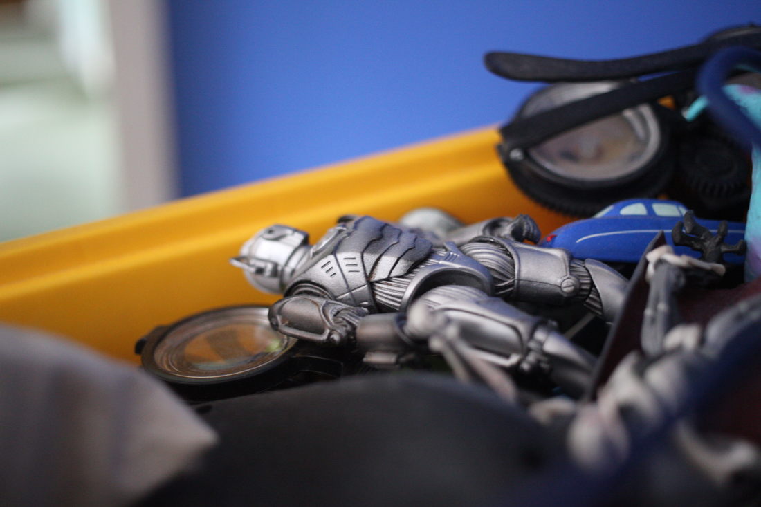


I think it's good that I used both close-ups and full scene shots in these images so the viewer can understand details but also get an overall view on his personality and the way he lives. These could improve if I found a way to represent more traits and give a deeper look at the person's mind and personality rather than just showing the hobbies I could see around his room.
Fragmented portraits
|
Erwin Blumenfeld used shaped glass and refractive material to distort and warp the subject and portrait. This can sometimes distort their face making it unidentifiable and therefore anonymous. Blumenfeld may of done this to make the viewer question their identity and the importance of appearance.
|
|
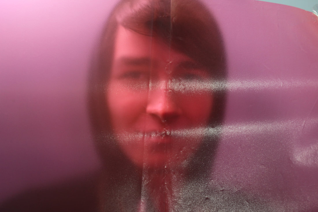


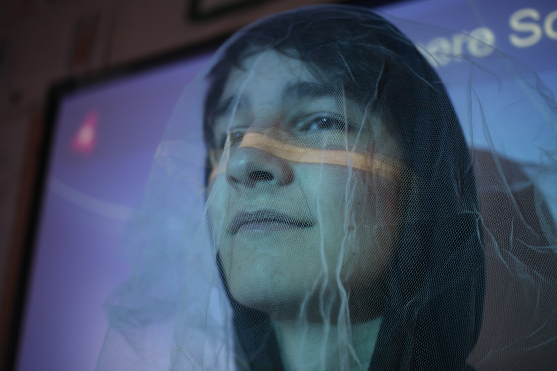


best 2

|

|
I think this could've worked better if I used more interesting materials like distorted glass as some of the materials didn't effect the subject that much. In my opinion the plastic red and green sheets worked well as they blurred further away areas and the change of colour warps and changes the portrait image but the cloths and textile materials did not work well at all as no significant change was made. This links to fragments as we can only see a distorted view of the portrait, only giving us a fragment of the information we would usually have to interpret and understand. To improve I should try use frosted and distorted glass as I think that would work much more effectively than any of the materials I sued.
andreas gursky
|
We visited the Andreas Gursky exhibition in South Bank Centre, Hayward Gallery. He stitches together lots of different images from different angles and perspectives in order to create a hyper-real view on an environment with an impossible amount of detail. This stitching of images reflects the themes of fragments as it's like multiple fragments from different images to create a larger image with more detail.
|
|
Some photos taken around the area:


three strands
strand 1 - Beth thompson
|
Beth Thompson uses Photoshop to create a kaleidoscope-esque image of an environment. This fragments the subject and environment, taking the viewer more time to analyze and regard in order to understand the image and look beyond the patterns.
|
|
My process:
My attempt:


I think my image is much more chaotic and less harmonious than Beth Thompson. Although this could add to the image, I feel like it loses the effect. On the other hand, I think the shards better represent the theme of fragments as it looks like the image was cut up and pasted back together in an almost uniform pattern. The images were used from the photos taken either around the school or from the area around the Andreas Gursky gallery.
strand 2 - Liesl pfeffer
|
Liesl Pfeffer creates photo collages of nature composed in such a way to resemble mountains, lakes and various dramatic landscapes. This makes it hard for the viewer to focus on individual images and rather makes them consider the entire image.
|
|
Some images taken from a holiday used:


My attempt:
I think although this is similar to the artist, I need to add more shapes to make the image more complex and interesting. I could further develop it by creating different landscapes and using different images for the fragments. This image links to the theme of fragments as it's small images coming together to make a larger collage as if the landscape had been cut up and put back together. The images used to create it worked well as the variety of landscapes gave me a lot of different colours and shades to work with to create the collage. Perhaps to improve I should create a more detailed image with more shapes.
strand 3 - Clint Fulkerson
|
Clint Fulkerson uses line art in order to create a simplistic view on a shape or pattern. You can tell just from the line density and shape the general geometry of the shapes, for example some you can see are made from a few merged spheres. This links to fragments as it's striping away all parts apart from the essential edge lines, fragmenting the image back to the basics. I am planning on using the line art but in a different way, like over another photograph or portrait.
|
|
My process:
My attempt:

Although the image doesn't completely represent the artist, some of the line art and pattern style is carried over. I tried to use the lines to represent the general flow of the shape and to have a higher density of fragments where there's more detail needed. I also did the lines to follow the shape so you could probably tell the shape and what the subject is with only the lines. I kept the all the fragments in triangles to retain a pattern and reflect uniform shards. I think it could be better if some of the shards were better ordered to keep more detail. If I attempt to develop this further I should try to find a faster way of carrying it out so I can add more detail without it taking a long time.
chosen strand - Strand 3
Development 2
|
In this development I explored the effect but using different subjects and some landscapes rather than a portrait. I also tried using rectangular faces rather than triangular and tried without using the lines/faces concept entirely. This creates a different effect making the image seem more flat and takes away the three-dimensional effect created by the lines like how Clint Fulkerson uses it. Without the lines, the image relates more to Thomas Danthony who makes images consisting mainly of only a few colours and little shading - only flat colours.
|
Thomas Danthony:
|
|
The one of the building is similar style to my first development but using rectangular faces rather than triangular to keep a more uniform flow and to better show the topology of the building. A portrait subject is more organic so the more chaotic triangle faces work better while the building is hard-surface and consists of more simple objects, better represented by rectangular faces. I think it could be improved if I used more lines to capture more detail but used an object which is easier to show and less time consuming. This reflects the theme as it's a simplistic, fragmented outlook into an environment. This strips the image to it's essentials, taking away clutter and excessive detail in the landscape and environment.
|

Before (may have too many curves to work with the art style)
|
|
On the right (of the mountains) I think I could more effectively capture the style of Thomas Danthony if I used an image with silhouettes and limited the colour pallet to only a few complimentary and harmonious colours, to create the contrast that the artist creates in his images. Furthermore, I should use some gradients rather that only flat colours to give the image some shading and make it easier to make out the shape. Moreover I need to use a different process to better capture the clean curves Danthony uses in his images. This is linked to the other developments as although it is different, it still works on taking away everything from the image apart from the essentials to understand the image.
|

Before
|


I think I prefer the style I used in my previous development as these ones were time consuming and didn't represent the theme as well as the first development did. They still simplified the image but I think the chaotic look of the lines in the first development worked better and showed how you can make out an image from simplistic lines and colours. For my next development I think I will try different subject matter but keeping the triangular faces in the first development and possibly try thinking more about the colour pallet like Thomas Danthony. Possibly try using structured and flat objects with the more cluttered triangular shapes to show organised objects to become disorganised and reduced to it's simplest form.
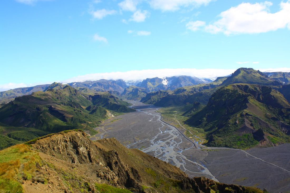
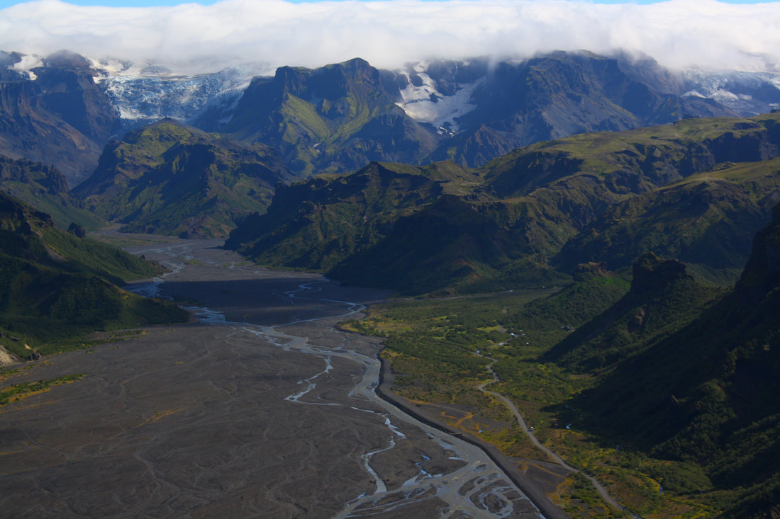
development 3
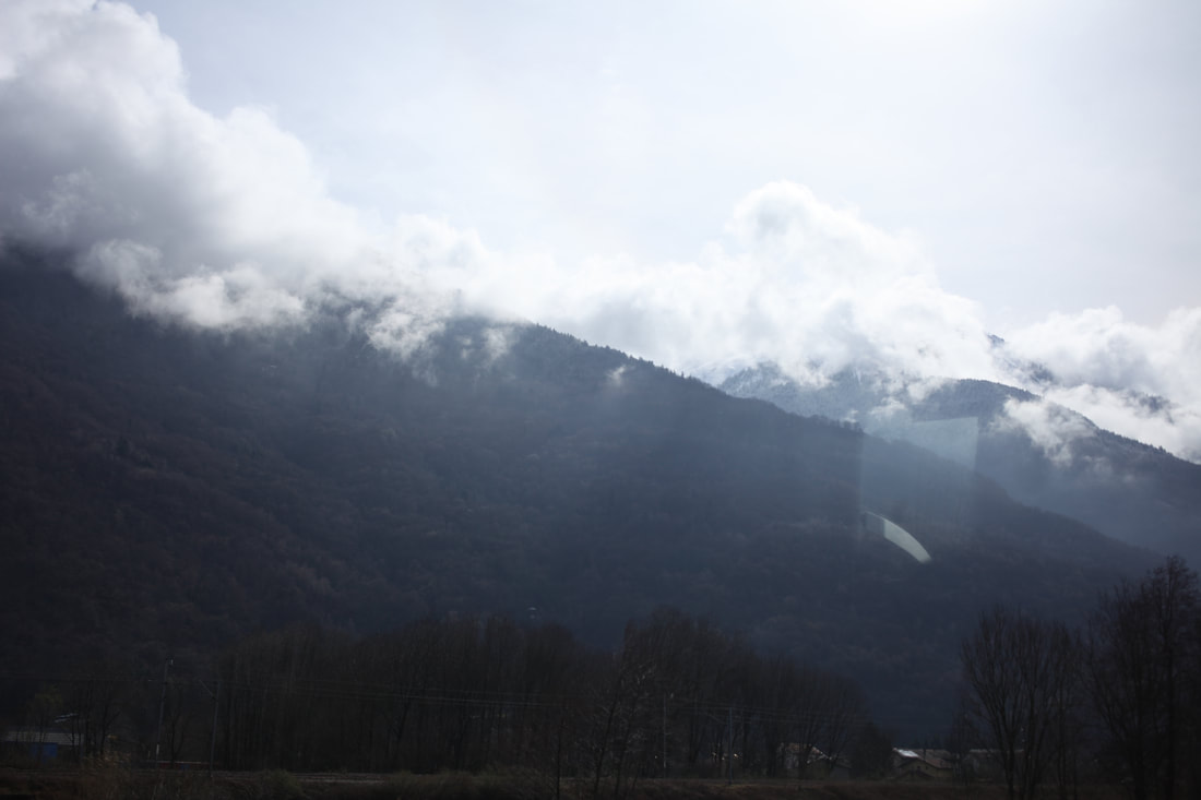
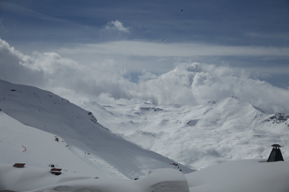
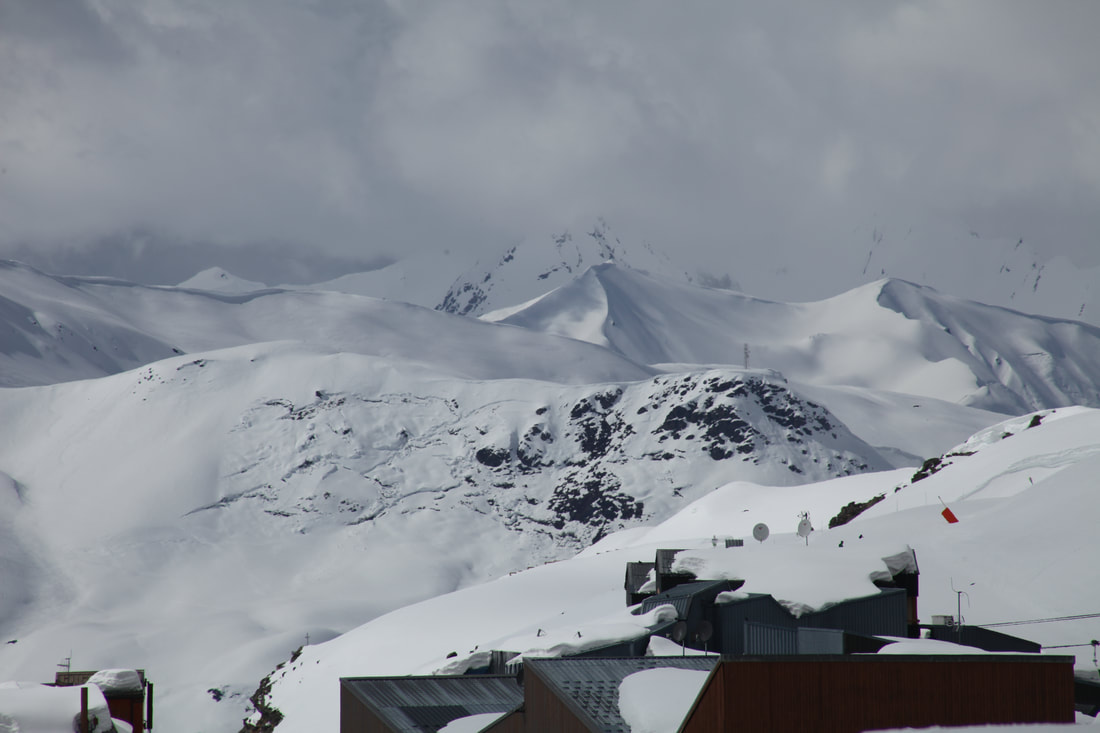
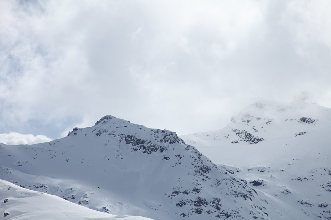
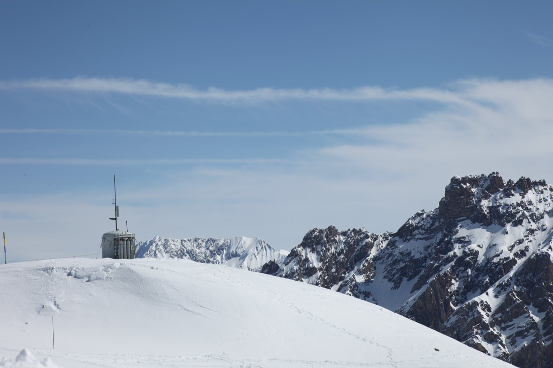
For this development I made sure the image consists of organic objects and environments rather than buildings and other man made objects as they don't work as well. The images I use are from a holiday in the French Alps which had plenty of varied dramatic landscapes which worked well for this task. The large scale and sublimity of the landscapes will hopefully create a more interesting and appealing image. I prioritised aperture and used a high f-stop so that no detail is lost through depth of field. Because there was a lot of light, I could keep a high aperture while still maintaining a fast shutter speed and low ISO so the images were good quality and retained detail.


Process for one of the images:


|
I would say the gif I made wasn't very successful because of imperfections with the frames of the image. Apart from that, I think the switching of the pieces of the image is a good representation of the theme as it shows the image to be broken up and mixed around. This is similar to an A-level photography student who also mixed around segments of an image in a gif. The switching parts shows fragmentation as it reflects mixed up shards of the image.
|
An A-level student's work it was inspired by:
|
|
The image of the plant I think was successful because of how I did more detail for the parts of the plant in focus which mirrors the detail someone would see in the original image but the geometry and colours are differently represented. I also quite like the object floating with a plain background, bringing attention to only the subject. Fragments is represented here through the abstraction and simplification of the original image.
|
|
Finally, the last photo I think was successful because of the subtleness. The change doesn't overwhelm the image, only modifies it a bit and adds a bit of interest. Although, I am unsure if this meets the balance between subtle changes and not enough changes. I do like the image for it's background and the amount of changes I did to make the image work like re-adding lost detail and changing colour balance to fix white balance issues.
Mark dorf
|
Mark Dorf's 'Axiom & Simulation' uses a combination of digital and natural elements to create his images. The images show simple geometry of natural objects and relating natural landscapes to digital shapes and functions.
|
|

I think that the squares as opposed to the triangles look good but it makes it look too consistent and I like the unpredictability and lack of pattern in the triangular faces. I think although it could reflect Mark Dorf's art style it doesn't feel very similar, just the ideas of digital images onto nature ones are shown across both our images. This shows fragments as it's fragments of digital and natural worlds mixing but overall I don't think it shows fragments as well as the other images and developments.
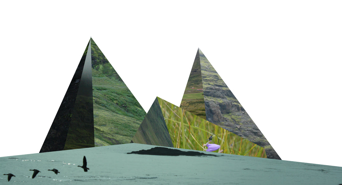
final piece
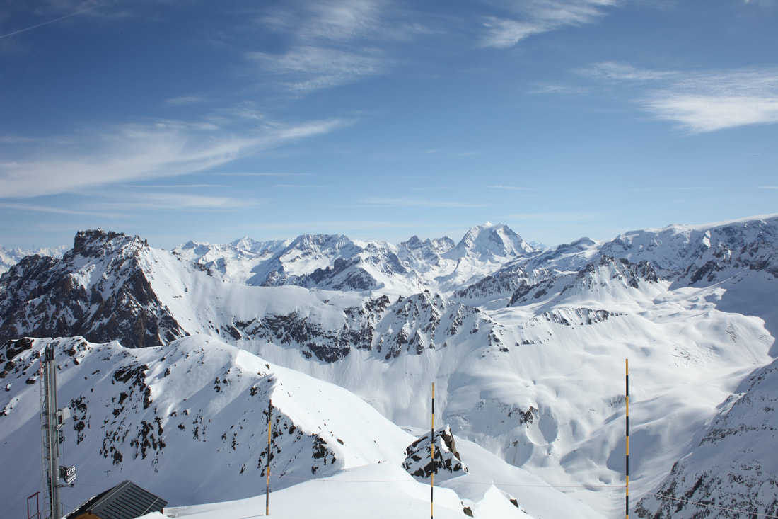
For my final pieces, I'm going to go back to my older developments where I use triangular faces and the average blur technique in order to simplify the geometry and colours in the image. This simplification reflects the theme of 'Fragments' as it's like a fragment of the detail you would normally see, giving the viewer less information to work off and understand the image with. I will use mountain images as they create a large scale, make the image more aesthetically pleasing and also more dramatic.
finished piece


Compared to my other images, I think the scale of the landscape makes the images much more interesting, and the translucent layer of the average blur adds an extra element of interest to the image. I left the sky the same as the image to reflect Mark Dorf's images as he doesn't change the entire image, he leaves natural areas with the digitally edited ones. I think the first one is more interesting to look at because there's more detail with the lines but I believe that the second image shows fragments better as it simplifies the geometry and the image more than the first, showing the viewer what the geometry looks like stripped to essentials. On the other hand, the first image is more chaotic and less uniform than the second which I feel better represented fragments. If I were to develop it again, I would try a slightly different landscape to see if I could create a different and more interesting effect.
