thomas struth
Thomas Struth takes photos of large cities and buildings. He uses techniques such as a small focal length to create a sense of scale an emphasize the size of the buildings and the city. He also uses a high f/stop to make sure no details are lost to depth of field and it shows the scale of the building compared to the other buildings.

|

|
Georges Rousse
Georges Rousse paints and manipulates the environment so that through the camera lens there's a different, colourful environment within a 2D shape such as a square, a circle or a star. This creates an abstract, colourful frame into a photo which would be otherwise ordinary.

|

|
Sato tokihiro
Sato Tokihiro used a long shutterspeed and a light to create detailed light painting. This gives a normal photo an interesting abstract effect.


|

|
negative space inside
Negative space is when there's a large amount of area without detail. For example you might have a photo where the subject in front of a white, blank wall. This brings focus towards the subject as it stands out from the background. There's also another technique called the rule of thirds which helps with composition. How? What happens if the subject of your image is not central but positioned within one of the thirds at the edge of the frame?
It shows the rest of the image and the background meaning there's more for the viewer to look at.
It shows the rest of the image and the background meaning there's more for the viewer to look at.
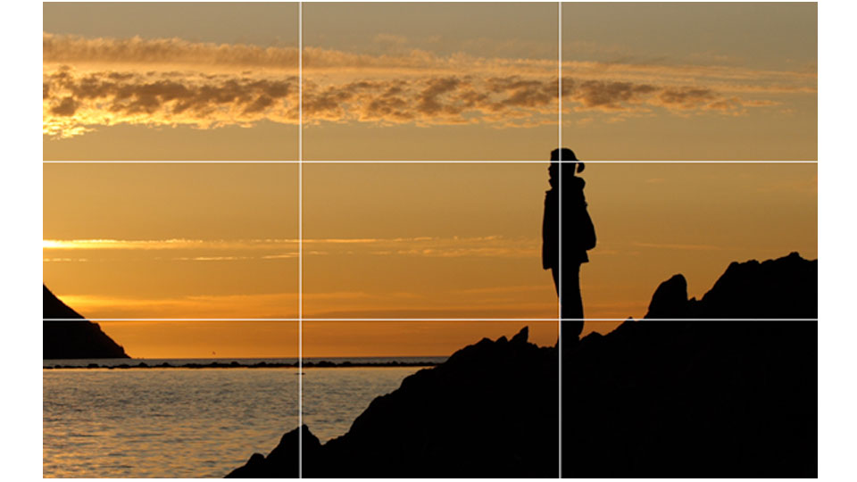
Example of rule of thirds.
Can you apply the rule of thirds grid to your own images?
cinematography
Cinematographgy is the process of making a video loop back into the same position seamlessly. This is usually used when part of the video is moving while the other half is completely still.
I haven't done an example yet.
I haven't done an example yet.
Framing
John Divola
John Divola uses the windows of an abandoned house to frame the environment (eg. the ocean). He uses this technique to create an effect of looking through another perspective.

|

|
Framing can be used in the to highlight a certain area or subject within an environment. It also gives an effect of looking through another perspective or that the viewer is looking at a photo of another image in a frame. This can lead the viewers eyes to what's inside the the frame meaning it's a good idea to have the subject within a frame.

|

|

|
What about using an existing frame to frame the landscape beyond it? Some of these need subtle adjusting to improve composition and contrast.
I'm not sure what you mean by 'What about using an existing frame to frame the landscape beyond it?'. Do you mean use a frame to frame the environment rather than a person or subject?
I'm not sure what you mean by 'What about using an existing frame to frame the landscape beyond it?'. Do you mean use a frame to frame the environment rather than a person or subject?
Pattern
Taking close photos of a recurring pattern within the environment. Patterns can be pleasing to the eye and also make good backgrounds as a subject would almost pop out from the background.

1/6, 5.6 f/stop, ISO 800
|

1/160, 5.6 f/stop, ISO 200
|

1/80, 5.6 f/stop, ISO 640
|
The good the bad and the ugly
In this project we were required to find small details within the environment which fall into one of the three categories: good, bad or ugly. This shows the contrasting environment that the photo was taken in.
A good photograph would be one with harmonious colours and fits in with the environment. It could also be where people have done something good in the environment or are fixing an issue.
A bad photograph might be one with clashing colours or contrasting objects within an environment. It could also be a photograph which captures an issue in the environment.
An ugly photography would be a photography with very clashing colours and of objects which don't fit with it's surroundings.
I think I successfully captured bad and ugly but didn't take enough photos to fall into the 'good' catagory.
To improve I would try to take more photos and spend more time finding photos which more obviously fall into a certain catagory. Also, I had my ISO too high on many of the photos making them noisy.
To improve I would try to take more photos and spend more time finding photos which more obviously fall into a certain catagory. Also, I had my ISO too high on many of the photos making them noisy.
Photoshop Editing
In some of my photos I use masks, changes in levels, brightness, saturation/vibrance and I add a vignette in order to bring attention to the subject and make the photo a better exposure/saturation.


|


|


|
WWW: I edited the photos to lighten the images, sometimes saturate them and create a vignette to bring attention to the the subject.
EBI: I spent more time on some of the images to edit them better and spent more time on masks.
EBI: I spent more time on some of the images to edit them better and spent more time on masks.
Formal elements
Formal elements are generally accepted as line, tone, pattern, texture, shape, form and colour. In Photography we also refer to focus, depth of field, perspective, scale, balance and composition. These can be used to emphasize certain parts of a photo or lead the viewer's eyes towards the subject of a photo. Formal elements are important in making sure the subject stands out from the background.
Homework
Where are the formal elements pics you did for homework? Are they below? Separate them from this task.
Extra photos taken as a homework:
Top 9

Gradient

Monochrome Urban

Colourful
|

Contrasting

Split

Scale
|

Silhouette

Macro

Decaying
|
It will be more sophisticated if you change the colours to something else? eg: trail, remnant, travelling, distance, end, You seem to be struggling with finding words. Ask people to describe them to you,
They were a placeholder until I had thought of better ones. I have changed them now
They were a placeholder until I had thought of better ones. I have changed them now
Top 3
The top 3 from my top 9.
Colourful: Having much or varied colour; bright/full of interest; lively and exciting.
Monochrome: A photograph or picture developed or executed in black and white or in varying tones of only one colour.
Urban: In, relating to, or characteristic of a town or city.
Contrasting: Differ strikingly/compare in such a way as to emphasize differences.
Monochrome: A photograph or picture developed or executed in black and white or in varying tones of only one colour.
Urban: In, relating to, or characteristic of a town or city.
Contrasting: Differ strikingly/compare in such a way as to emphasize differences.

Colourful
I like this photo because of the different colours and the repetition in the architecture.
This photo colour be better if it was brightened a little and edited more.
This photo colour be better if it was brightened a little and edited more.

Monochrome Urban
I think this photos is good because the contrast makes the foreground stand out.
I think this photo would be better if I used a lower ISO to decrease the amount of noise and grain in the photo.
I think this photo would be better if I used a lower ISO to decrease the amount of noise and grain in the photo.

Contrasting
I think this photo was good because the light from the sign really contrasts with the dark background around it.
I think it would be better if the background was more interesting and I lowered the noise by using a lower ISO.
I think it would be better if the background was more interesting and I lowered the noise by using a lower ISO.
homework: expanding on top 3
For this I picked my favourite three photos from my top 9 and took more photos using the adjective used.
Colourful
For colourful I used a higher saturation to make the colours feel bolder and stronger.
monochrome urban
For monochrome urban I used aw high contrast to highlight the difference between light and dark in the images.
contrasting
In contrasting I tried to use a lot of silhouettes a contrasting backgrounds in order to make the foreground standout from the background.
WWW : Your photos are at a amazing standard and you have the right amount of photos all together.
- Your Colourful Strand is your strongest strand and works really well with the adjective.
EBI : If you add the location to each of your strands.
- Composition could be set out better, using a gallery for your photos instead of a slideshow.
- Your Colourful Strand is your strongest strand and works really well with the adjective.
EBI : If you add the location to each of your strands.
- Composition could be set out better, using a gallery for your photos instead of a slideshow.
Close up and far away
Taking both close up and far away can show the details and differences within an environment that you might not usually see. I used a few different adjectives for these rather than just one.
Monochrome Urban:

Far Away


The macro was achieved by removing the lens and switching the lens upside down to create a macro effect. This worked particularly well with my lens as it had a low focal length which when using the lens upside down means you can get very close to the object while still remaining in focus. I used depth of field/a low f.stop on the close up photos to emphasize the scale of the closeup and I also used a high focal length to get closer image of the object but also emphasize the size of the background in comparison to the subject of the photo.

|

|
Surely the work below should come above you urban monochrome. Or are these some of you pairs? Try editing some of them into one complete image like we did before the holiday.
They are in pairs, I'll put them together in photoshop
They are in pairs, I'll put them together in photoshop

|

|

|


|

|

|


WWW: I think most of the closeups successfully showed some of the finer details in the photo/environment.
EBI: I used a better theme and used it consistently.
EBI: I used a better theme and used it consistently.
