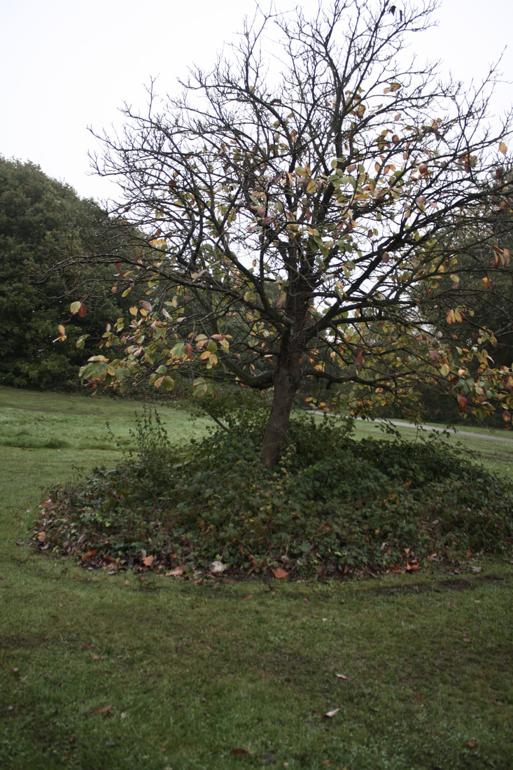
Gregory Crewdson - cathedral of pine
These are some of the photos from Gregory Crewdson's photography series called 'Cathedral of Pines'. Cathedral Pines is a nature reserve in Connecticut where Crewdson used to go to as a child. Crewdson used a smaller cast of people than usual - around 15 people - while some of his projects had up to and over 50. These sets of photos were more personal and the actors used had some link to Crewdson: either a relative or a friend. Each photo has recurring props like pill bottles, ash trays, matches, glass of water, books with the same titles etc. which suggest the use of anti-depressants or other drugs and the props could represent their desires or what they're thinking of. Each picture has an out of place object and leaves the viewer to create their own theories or stories behind the photograph and on top of that the emotional blankness of the people in the images suggest they're using antidepressants (shown by pillboxes around the image) leading to their numb and empty expression. Gregory Crewdson uses a lot of artificial light to bring attention and lead the viewer around the image. 'Cathedral of the Pines' had a smaller cast and he also used more natural lighting that artificial.
Response
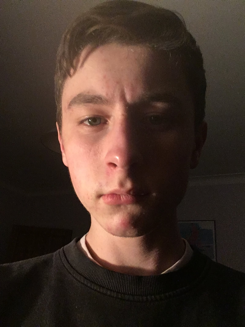
This was my attempt at capturing the style of Gregory Crewdson from what we learnt from the exhibition trip.
I think I could've improved the photo if I used a higher f/stop with a tripod in order to capture more detail. I think I could also have the lighting done better as it's one of the main aspects of Gregory Crewdson's photography to use light to lead the viewer to each part of the image. I think though that generally these images captured his style and composition of images.
The subculture archive

Subculture archive is a collection of photos and images showing many different youth subcultures around Britain. The gallery represents a lot of subcultures and attempts to capture their personality and their ideals. Subculture definition - 'A cultural group within a larger culture, often having beliefs or interests at variance with those of the larger culture.' This relates to the theme as it shows a subcultures from older and younger generations all within the same area with conflicting and different ideals.
Gallery visit
During the holidays I went to one of the free exhibitions in the Tate Modern. It was a mixture of art and photography where one set of photos were documenting a photographer's trip around America which helped for inspiration for my journey task. The gallery helped me understand how to show a journey you need a mixture of close up images and images of an entire environment in order to capture every detail of journey and the location.
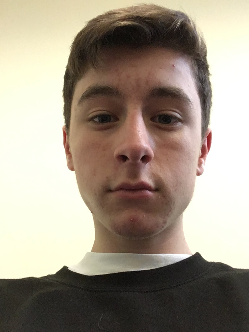
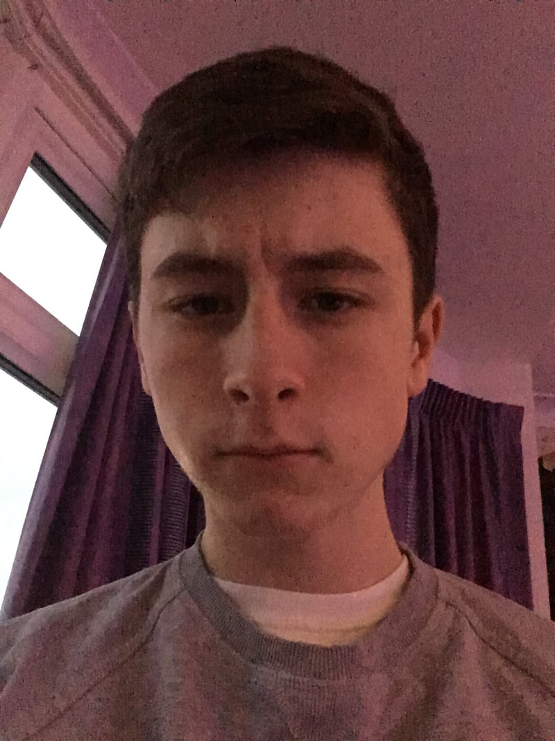
Selfie timelapse
|
For this task we had to take a selfie every day for an extended period of time. This will then be edited into a time-lapse which shows how we change over time. I tried to keep my eyes in the same place so you can easily see the changes throughout time. Noah Kalina took a photo of himself every day for a long period of time in order to show a large amount of his life pass in only a few minutes. It would've worked better if my face was always straight and the if the camera was fixed: so the background is the same and you can focus on the face changing. On the other hand, the different backgrounds and lighting could highlight the change in time and location - contributing to the theme of time and past, present, future.
|

|

|
|


Journey
|
I went on holiday to Madeira and took some photos to document the journey round to different parts of the island. The journey can relate to the theme as it shows a passing of time across the trip. This is inspired by Lee Friedlander and Wolfgang Tillmans who documented their journey's through photography sometimes including their shadow or reflection. This links to the theme as each photo is from a different time and therefore it shows the viewer an image from each part of the journey so it's like they're travelling where you already have been in the past.
|

Image by Lee Friedlander
|
I tried to take photos of large and small details and sometimes incorporate my reflection and shadow (although I should've tried to do that more than I did).
I tried to capture as much of the culture, nature, architecture of the island as possible to show what its like there although I think the photos would be better if they included my shadow/reflection more often and if they documented a more specific journey rather than one across more than a week.
I tried to capture as much of the culture, nature, architecture of the island as possible to show what its like there although I think the photos would be better if they included my shadow/reflection more often and if they documented a more specific journey rather than one across more than a week.
A shortlist of all the photos from my journey.


|
|


Portrait - present and future
This task will show someone to look older than they do now with Photoshop. It shows the transformation from the present to how they look in the future. When we took the photos I used flat lighting, a white plain background and that the photo was from the front. After that we found a picture of an elderly person on the internet that had the same flat lighting, the same angle, some of the same facial features and a good resolution to avoid pixilation. This links to the theme of Future as it gives a window into what they could look like in a few decades by using a picture from the past/present.
|
|
|
I think I successfully aged the subjects and picked relatively good images that matched although it could work better if the lighting was similar and if the ageing was a bit more subtle in some areas. It was difficult to get photos which worked with the lighting and that matched the emotions and facial features. It also had to be in colour (a lot were in black and white) and it helps if it has the same warmth (but that can be changed in photoshop).
Bobby Neel Adams created pictures called 'Age Maps' where he took childhood photos and photos of older people and matched them up seamlessly. He then tore down the middle of the image creating a cut from child to adult. This could show a thin divide between adult and child or could be trying to show everyone's inner childish behaviour.
Bobby Neel Adams created pictures called 'Age Maps' where he took childhood photos and photos of older people and matched them up seamlessly. He then tore down the middle of the image creating a cut from child to adult. This could show a thin divide between adult and child or could be trying to show everyone's inner childish behaviour.
Past into present
|
In this task we got an old photo and lined it up to the same location in the present. This links to the theme Pasta and Present because it shows the change from what happened in the past to how things look in the present. Lining up the photos helps so we can see the exact similarities and differences. This is taken from Taylor Jones who did the same thing from childhood photos.
|
|
|
We used a high aperture in order to capture as much detail of the background as possible but the problem with this is that it would give a high shutter speed which sometimes blurs the photo. Another problem was lining up the picture perfectly as a lot has changed and the camera taking the original photo probably had a different focal length and maybe a view which is now blocked. This links to the theme as it creates a bridge from the past to the present and a comparison of everything which has changed over the years.
|
|
past photos in the present
|
Irina Werning in the 'Back to the Future' project recreates childhood photos with the same people in same area etc. This links to the theme Past and Present by showing how the people in the photos change from childhood - from past to present.
|
|

|

|
We also tried to recreate what Irina Werning did. This presented a few challenges such as trying to find the background, similar clothes and to try and mirror the facial expressions and composition. Next time I should try take more images and also attempt to match the lighting to make it look more similar.
Super power
In these pictures we use a quick shutter speed to simulate levitating and used Photoshop to show a superpower. This links to the theme as it could show the future where superpowers could be real or technology could allow some if these superpowers to be possible. Would be better if we did more creative poses in the air and I brushed up on Photoshop skills to make the superpowers more interesting or realistic.

3 strands
matt wisniewski
|
These photos by Matt Wisniewski use double exposure editing to show a connection with the person and the background - for example the shapes couple match with the shapes of the subject or the background could represent the subject's emotions. This links to the theme as the background and foreground photos were taken at different times therefore is a bridge from past to present through editing.
|
|
My attempt:


|
I think this was successful because of how to foreground and background mix dynamically and I believe I successfully Photoshopped the images to work together and make it so the viewer can easily make out both images together. I think this could be better if I used a greater variety of backgrounds and maybe more people in the foreground so there is more of a variation in the images I use. I am using this as my chosen strand as I believe it was my most successful strand and it's very easy to develop the strand into something new and interesting without being too similar to the original strand or artists. Also all the background images were from the same holiday so I think I should develop it to have a change in background and environment.
|
|
Pep ventosa
|
This artists takes a lot of pictures around and of a landmark or object at different angles and blends them all together to make a blur of the picture. These final edited images show lots of pictures at different times compressed into one, therefore giving the viewer a insight into a larger frame of time than just a normal photograph.
|
|
My own attempt:


I think the blurred effect was successful and for the most part you could make out the main characteristics of the photo. The only issue with some of the photos in my opinion would be that the main subject should be lined up better with the rest of the photos, or it would become too blurred and obscured. I think I'm not going to do this as each picture takes a long time to produce and it's difficult to line up each picture perfectly through the viewport. There are probably interesting ways to develop this though with different environments and different amounts of photos.
Mauren Brodbeck
|
Mauren Broabeck edits their photos to block out buildings with just a single colour. This adds a bolder colour to a relatively grey and colourless city environment and makes it stand out from the others. It also makes it almost completely inconceivable for the viewer to identify the buildings or any features of it therefore making it difficult for the viewer to understand the time of the photo or the age of the building. This therefore puts the photo in neither past, present or future and makes it completely timeless.
|
|
My attempt:


|
To create this I outlined the building in photoshop, created a selection, filled the selection, then using colour overlay in order to change the colour of the building easier. I think the colouring of the building was successful and reasonably accurate but the buildings I chose were not very significant and only took up a small part of the frame. I'm not choosing this as a final strand as I'm not sure how I would further develop it and one photo takes too long to produce.
|

|
Chosen strand - Double exposure
brandon kidwell
|
Brandon Kidwell uses double exposure to tell a story or so some sort of narrative as opposed to Matt Wisniewski who uses the images to possibly represent the subjects' mind and emotions. Kidwell also uses different areas of the body such as hands to make it look like the subject is reaching towards the background. This can link back to the theme as the story told in through the double exposure image are likely to be from the past. Also, the two photos were taken at different times therefore showing two different time frames. The background image is usually of a person walking in a certain direction which could make the viewer imagine where the person is travelling. Also, I think the man in the background is the same as the person in the foreground, which might make the viewer believe that he's reflecting on what has happened in the past. To develop on the original strand I plan to: use a greater expanse of environments and images; use background images which tell more of a story; use foreground images of hands so not only faces and lastly possibly overlay a grunge texture to make the white in the background more interesting than just a solid colour.
|
|
My attempt:
|
I think the hands worked well and was more interesting than just using faces. I think it could be improved if the person in the background was centred in the image like how Kidwell did in his images and make the person stand out more. I think the grunge texture overlay in the background makes the image more interesting and give less empty, blank space. Some interesting ways to develop it would be to use masking so some parts of the foreground image and invisible. For example, the face could fade into the sky of the background photo. Another improvement could be attempting to use more colour.
Some examples of Double Colour Exposure. This can further link to the theme as the mask could show the join between the two time frames in the image and the colours can help emphasise the past and the present picture (as they were both taken at different times). |
|
Attempt at doing double exposure with masking and more interesting background images:
I think the masks makes the image more interesting as it blends the images together more seamlessly. I think in the final piece I should overlay a grunge texture or add some background so it's not plain white and it makes the image more interesting.
Final piece
|
Examples of some of the images taken of buildings:
|
Examples of some of the portraits used:
|

For the images of buildings I prioritised aperture keeping it as high as possible in order to retain detail and keep focus on the entire landscape while as a low aperture would lose some detail in depth of field. Furthermore, as a high aperture lets less light into the camera and resulted in a slower shutter speed I used a lower focal length to both capture more of the landscape and reduce shake and also used a tripod for some of the photos when it started getting darker and more difficult to hold still. I think these images could be improved if I was further from the buildings therefore having a skyline of multiple skyscrapers and if I bought an even lower focal-length lens (my current one goes down to 28mm) as a very low focal length can create an interesting fish-eye effect which could look interesting in double exposure. Exposure I kept average but some of them were underexposed to create silhouettes. I should've taken more day photos as the sky would be more plain and easier to cut out. The darker the sky gets, the closer the colour of the sky is to the buildings making masking harder to do accurately and easily.
|

For the portraits I prioritised shutter speed to try and get the sharpest image possible. As there was only one subject and a blank wall behind them depth of field wouldn't effect anything allowing me to use a low aperture to let as much light in as I could. I tried to balance the exposure and use lighting so that there was a blend of light and dark - allowing the background of double exposures to show through in different areas. I think the portrait images would be better if there was a strong single light and little ambient lighting so the double exposure could show through the dark side of the face.
|
I took final piece pictures in a raw format in order to get better resolution for printing and more freedom in editing. Raw image formats have not been at all compressed therefore hold all colour and image data in how it was taken - while JPEG format would have compressed it and lost detail.
This final piece links to the theme of Past, Present and Future as the images were taken at separate times which show two different merged time frames. The images show the relationship with the subjects and the background and how the environments can effect people. The blending of the images shows the connection between the people the environment and the people over time. I think I could've shown the theme more effectively if one of the images was animated or long exposure to create another layer of time within that one. I could've also used colours more to show a separation in the images and emphasise a difference in time. Although some things could be changed I believe the images effectively show a different of time to a certain extent and also successfully merge the background and foreground.
The editing process for one of the images:
The photoshop steps are reasonably complicated but it's easy to recreate in different scenarios allowing for a variety of images.
Finished images:


|


|
evaulation
I think the double exposure was successful with some of the images, but the ones coming out the top of the head look odd in my opinion and would be better if I rotated the city image at more different and interesting angles. I feel that the portrait images were good but could use harsher lighting with darker shadows. The city images were good but could be better if the buildings were larger and more dramatic. I think the more dramatic buildings and lighting will help deliver the theme of force better.
Further development - Christopher J and Nevess
|
|
|
Develop by:
- Rotating the buildings and city skylines to cut out different parts of the image.
- Superimpose lines, birds, lights etc. to make the image more interesting.
- Consider using a background instead of plain white.

|

|
These images didn't work very well in double exposure as the horizon didn't have too much variation, which is an important part of double exposure as the more complex the skyline the more interesting the end product looks.
thomas struth
Thomas Struth takes photos of large cities and buildings. He uses techniques such as a small focal length to create a sense of scale an emphasize the size of the buildings and the city. He also uses a high f/stop to make sure no details are lost to depth of field and it shows the scale of the building compared to the other buildings. It's a good reference for how any background pictures of skyscrapers and building should be taken.

|

|
Christoffer Relander
We've studied some of Christoffer Relander's work and have recreated it. In his "We Are Nature" series, Christoffer uses the double exposure technique to show the person almost merging with nature.

|

|
Christoffer Relander creates surreal portraits. He does this by editing together a portrait and a image of nature using multiple exposure. I believe he wanted to show us the relationship between man and nature. The way he merges the pictures make us feel that people, even in this urbanized era, are connected and at one with nature.
Relander is not considering any specific individual in this piece of work. This is shown by how each subject is different from one an other. A lot of the individuals are of a different age, gender and race to each other. Also, all of the subjects are kept hidden by nature, making them anonymous and making it difficult for the observer to see many distinguishable features on the person. By keeping the identies of the models anonymous, it allows the viewer to develop their own opinion.
Relander has used multiple exposure in creating this work. This helps create a merged effect with the model and the background. This means the model is covered and anonymous, meaning the image doesn't apply for one specific person - it applies to everyone.
Double exposure is when you have a silhouette of a person in front of another photo. This can be used to show the person's connection with the background. For example, putting someone in front of a city landscape could show the persons loss of individuality with the city and the people in it.

Original Photos


|

|

|
|
My Photoshop layers:
Top layer is on the blending option of 'lighten'. Lighten: 'If the pixels of the selected layer are lighter than the ones on the layers below, they are kept in the image. If the pixels in the layer are darker, they are replaced with the pixels on the layers below.' Second layer is the subject with a white mask around the head/shoulders. Third layer is the normal landscape with the opacity lowered to make the background a light version of the landscape. Bottom layer is just a white. |

|
I think I successfully merged people and the city environment but to do better I think I could use better background photos.
|
Editing process for double exposure of the city.
Layer 1: The white background. Layer 2: Black and white image to make the city stand out. Layer 0 copy: Portrait image with a layer mask to cut out the subject and leave a white background. Levels 1: Brightens up the portrait image. IMG_0876: The image of the city with a layer mask to refine the image as some of it didn't look very good in the final image. This image is on the blending mode 'Lighten' so that if the pixels below it are dark, the opacity is higher, giving the double exposure effect. Levels 2: Brighten up and change levels of the city image (arrow shows that only affects the layer below it) At the top there's a black and white filter to convert the image to monochrome. |

|
I think although the portrait images were mostly good and worked, it might be better if some of them had more harsh lighting to make the image more powerful with more dramatic shadows. This difference between light and dark on the portrait image would result in a nicer double exposure image as the city would be visible on the darker areas and hidden on the lighter areas. I think the city images were successful and I correctly chose a good skyline and although there might of been more interesting background images, I think these ones work well. These final images strongly show the theme with multiple images showing multiple time-frames. The images further could show a connection between the subject and the background: as they have lived in the city it links the time they have lived and the interdependence they have towards the city and it's environment.
Final Piece


Annotation
Introducing a task:
Subject matter
ebi:
Subject matter
What’s next
- In this task I was required to…..
- This task links to the theme, Past, Present and Future as it shows....
- My intention was to respond to (either Past, Present OR Future). I chose to only look at (Past, Present OR Future) because I wanted to explore....
Subject matter
- The subject I chose to photograph suited the theme as it……
- My composition helped to support my response to the theme by….
- I managed the exposure very well. My ISO / shutter speed / aperture settings were…..
- I prioritised my shutter speed to… (capture movement / blur/ frozen moment)
- I prioritised aperture to manipulate depth of field.
- I used a tripod to avoid camera shake.
- My images express my intentions which were…
ebi:
Subject matter
- The subject I chose to photograph did not necessarily fit the brief as it was not interesting enough / appropriate / adequately lit…..
- Next time I should go to (a different location), photograph at a different time of day, organise people in advance, think more about my composition so that….. ect
- I did not create enough depth of field / sense of movement. The image is over exposed / underexposed / too blurred.
- Next time I should use a tripod / use a different type of lens (be specific) / experiment with film…
- My images do not show my intentions which were…
- The concept wasn’t clear in my images, I need to make it more explicit by…
What’s next
- Next time I will consider the work of (a photographer) to inspire a more accurate depiction of what I want to achieve.
- I will experiment further with… (blur / shutter speed / composition)
Analysis
What do you think the photographer’s intentions are? There may be more than one. ‘PEC’ each intention.
P (Photographer’s name) creates (what type of images? Fantastical, surreal, objective)
E He / she does this by… (describe something in the image)
C He/she wanted us to consider ….
What wider issues is the photographer addressing?
P (Photographer’s name) is considering (is the photographer talking about a bigger issue in photography, society, politics?)
E This is shown by … (describe something in the image)
C The (Photographer’s name) was interested in this issue because (they felt it was relevant to us now…)
How do the materials and techniques used support your photographer’s intentions?
P (Photographer’s name) has used (the darkroom / multiple exposure / film / digital manipulation techniques) in creating this work.
E This creates a ______ effect. (describe something in the image)
C This helps to support (Photographer’s name) point about (showing an identity / hiding a person’s identity / the media / anonymity)
